

Concept
The core concept of this project was to create a brand for a collective of designers, illustrators, and freelance developers working remotely from different parts of Brazil, whose goal is to contribute to projects for clients who value creative, human-centered work.

Target
Potential clients of the collective, including small businesses, cultural institutions, ethical brands, and collaborators.

Challenge
To create a visual identity that belongs to a transparent group with the philosophy 'art for humans, by humans'—not a faceless agency.
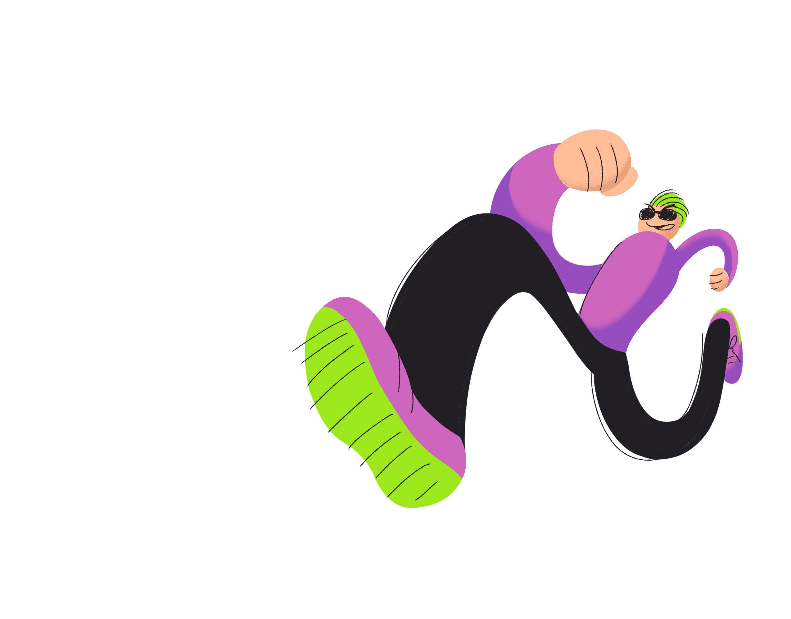
Logo
Final Version
Following the company's philosophy, the logo was created entirely by hand and then vectorized for use in .svg format and for any needs of the collective.
Each letter was made separately to facilitate customization when needed.
A handcrafted logo also ensures an aspect of originality, as it contains no public typography and cannot be easily replicated.
egarding the intention and concept behind the image, the letter N was stylized to represent a foot and connect to the concept of "Nômade," the studio's name.
The shape also references the artwork Abaporu, embodying the brand's identity-driven artistic ideals."

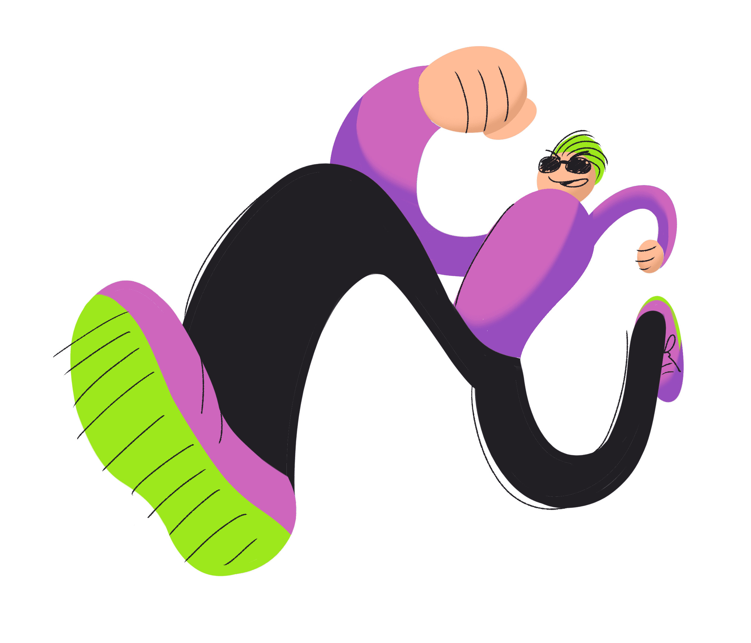
Visualization of vectorized paths.


B&W
Version
Version
The logo also allows for color variations based on the official palette, enabling it to be applied in its colored form while creating contrast and emphasis for the brand and avoiding tonal conflicts.
The distinctive and original shape of the brand ensures that changing colors does not hinder its recognition.


Icon Version
The simplified version, or logo, consists of the most distinctive part of the visual identity: the N from 'Nômade' with the stylized figure of a foot. The same rules for the black and white versions and color variations apply in this case.


Colors
The main colors of the identity are striking pink and green, representing the collective's disruptive, artistic, and distinctive personality. These bolder colors are balanced with more sober tones of blue and black, with blue being the main accent color of the palette. Two shades of pink were added to balance the contrast in relation to the other colors.
#292265ff
#cf66beff
#d689c1ff
#9de71dff
#211f23ff
Typography
Headers
Aa
Aa Bc Cc Dd Ee Ff Gg Hh Ii Jj Kk Ll Mm Nn Oo Pp Qq Rr Ss Tt Uu Vv Ww Yy Xx Zz 1234567890
The chosen title typeface is Chewy, available on Google Fonts. The reason for this choice was its resemblance to the handwritten style used in the word 'Nômade' in the logo.
Aa
Aa Bc Cc Dd Ee Ff Gg Hh Ii Jj Kk Ll Mm Nn Oo Pp Qq Rr Ss Tt Uu Vv Ww Yy Xx Zz 1234567890
For body text in both print and digital formats, the typeface 'Montserrat' was chosen because it conveys modernity and good readability while thematically complementing the Chewy typeface with its rounded shape.
Application


